Editor's Note: This is a section of our soon to be completely redone SEO Guide. Enjoy!
Even before the first Apple iPhone was released in 2007, marketers were asking the question: "What should my mobile strategy be?" And it's a question that many are still asking today. One thing is for sure, though: the mobile web is here to stay.
A recent report from BI Intelligence projected by the year 2020, there will be 3.5 billion smartphones shipped worldwide. And users are increasingly shifting to mobile as their primary device for accessing the internet. In fact, Google announced last year that now, "more Google searches take place on mobile devices than on computers in 10 countries, including the US and Japan."
This makes sense, because (as Benedict Evans recently wrote), "It's actually the PC that has the limited, basic, cut-down version of the Internet…it only has the web."
Our mobile devices have much more information to draw on than a desktop device:
As well as greater interactivity:
So how do search marketers ensure that this boom in mobile web usage won't leave them behind? By staying on top of the basics of mobile search.
How Google Deals with Mobile SearchGoogle has many different crawlers for different use cases and different indexes, such as:
For mobile search (specifically for smartphones), they use a version of Googlebot which uses a smartphone's user-agent, so that the crawler can have the same user experience as actual mobile users (such as redirects to mobile versions, etc.).
This is the current Googlebot user-agent for smartphones:
Mozilla/5.0 (iPhone; CPU iPhone OS 8_3 like Mac OS X) AppleWebKit/600.1.4 (KHTML, like Gecko) Version/8.0 Mobile/12F70 Safari/600.1.4 (compatible; Googlebot/2.1; +http://www.google.com/bot.html)
For comparison, this is the regular Googlebot user-agent:
Mozilla/5.0 (compatible; Googlebot/2.1; +http://www.google.com/bot.html)
It is worth noting that Google does not consider tablets to be the same thing as mobile. Although they do consider tablets a separate class of device from both mobile and desktop, nonetheless, their view is that "Unless you offer tablet-optimized content, you can assume that users expect to see your site as it would look on a desktop browser."
The mobile-friendly pages discovered by the smartphone Googlebot crawler, as well as mobile page versions discovered by the desktop crawler, are indexed as usual. However the SERP may include a different set of results for a mobile user than a desktop one, and mobile-friendly pages will be given a slight ranking boost, all things being equal.
Note that Google judges mobile-friendliness on a page-by-page basis rather than across an entire website, so if you have limited resources it is best to start by making your most valuable pages mobile-friendly first and branching out from there.
Google's Mobile-Friendly Update ("Mobilegeddon")In 2015, Google announced a new rankings update for mobile search, which was nicknamed "Mobilegeddon". On April 21, the rollout began, and the internet started to see the effects.
Some websites were directly impacted, losing up to 35% of mobile rankings within the 1st month — and some more indirectly, by the incentive to move towards mobile-friendliness before the update hit.
Google announced a 4.7% increase in the number of mobile-friendly sites in the time between announcing that the update was coming and when it actually rolled out.
Around the same time, Bing also announced they would be rolling out a similar update, although they haven't provided as much information on the timeline of this. However, generally speaking, a site which is well-optimized for Google mobile search should perform well in Bing.
A new version of Google's mobile-friendly update has recently been released (in May of 2016), so we can expect to see a further impact from this as a ranking factor over time.
So how do you make sure your site is correctly designed and optimized for mobile search?
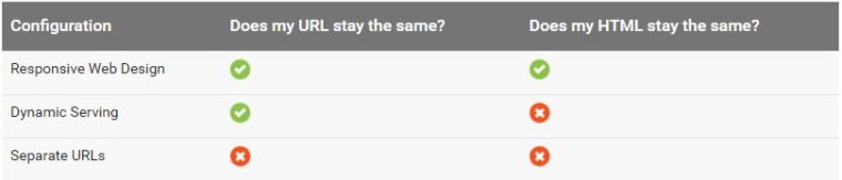
Making Your Website Mobile-FriendlyThere are three main approaches to making a website mobile-friendly. These are:
TIP: Google has expressed this is their preferred approach, although they support the other two as well. This is primarily because responsively designed sites don't require any additional technical implementation to optimize them for search.
When creating a separate mobile site, the best approach is to keep all the same pages and content in the same structure (e.g. www.domain.com/first-page and m.domain.com/first-page). This makes it easy to redirect based on user agent/device, and also to indicate to Google what pages are equivalent on the mobile vs desktop version.
But since it's a separate set of pages, you could choose to have a completely different site structure, in which case the mobile URLs might be different.
If you're wondering how best to implement a mobile-friendly design for your site, check out this guide from my company, Distilled, on "Building Your Mobile-Friendly Website".
How to Figure Out if Your Site is Mobile-FriendlyHere are a few tools you can use to check whether your site is mobile-friendly:
SEO for Mobile SearchIf you have a responsive site which is optimized for search, you won't need to do anything different for the mobile crawler. Note that when you are auditing the site, it is worth crawling it using a mobile user agent in addition to your regular crawl. This will allow you to identify any crawl issues which only occur on mobile.
Site performance (around things like speed and page load time) may also impact results for mobile search. An effective responsive site serves appropriately sized assets for the user's screen size, even if the underlying HTML/CSS is the same. It's worth checking site speed separately for mobile and desktop (and easy to do with Google's PageSpeed Insights tool!).
If you have a dynamically served site or a separate mobile site, you'll also need to add a couple of things to your pages to make sure that Google understands that the two versions are connected.
Optimizing an Adaptive Website for Mobile SearchAn adaptive (or dynamically served) site uses a single URL, but serves a different version of the HTML/CSS depending on the type of device requesting the page.
While basic SEO principles remain the same as for a responsive site, you also need to make sure you avoid the appearance of cloaking.
Cloaking is when you show one thing to a search engine, and something different to a human user, and Google will devalue sites that are doing this for SEO gains. (Note that visually hiding or minimizing content for UI purposes, such as including a menu which is collapsed on load, do not count as cloaking as long as the content is accessible to users and crawlers alike.)
In the case of a dynamically served site, you want to signal to Google that you are showing different content based on user agent to provide the appropriate version of the page for the device accessing the page, rather than to trick the Googlebot user agent for nefarious SEO purposes.
To make it clear that this is what you're doing, you should use the Vary-HTTP Header.
Using this header has two additional benefits:
A mobile site on a separate URL is effectively a different site, so you'll need to optimize these pages in addition to optimizing the desktop version. Again, the basic SEO principles remain the same, with a few extra guidelines:
Unless you've built your mobile site with very different content than your desktop site, the URL structure for your mobile site should mirror the relevant pages on your desktop site as closely as possible. So www.example.com/funny-story should become m.example.com/funny-story, not m.example.com/different-page.
A separate mobile site with the same or similar content as the desktop version could potentially be seen as a case of duplicate content, which may be suppressed by search engines.
This is where the mobile switchboard tag comes in. This tag indicates to Google crawlers that this is an alternate version of the site intended for mobile devices. A version of this tag is placed on both the desktop and mobile versions of the page.
To set up switchboard tags correctly:
These annotations can be included in the HTML of the pages themselves and sitemaps (but you don't have to do both).
As an example, where the desktop URL is http://example.com/page-1 and the equivalent mobile URL is http://m.example.com/page-1, the tagging for this example would be as follows.
In HTML:
On the desktop page (http://www.example.com/page-1), place the following:
<link rel="alternate" media="only screen and (max-width: 640px)"href="http://m.example.com/page-1″>
and on the mobile page (http://m.example.com/page-1), include:
<link rel="canonical" href="http://www.example.com/page-1″>
The rel="canonical" tag on the mobile URL indicating the desktop URL is always required.
In Sitemaps:
You can place the rel="alternate" tag for desktop pages in your sitemaps, as follows:
<?xml version="1.0″ encoding="UTF-8″?>
<urlset xmlns="http://www.sitemaps.org/schemas/sitemap/0.9″
xmlns:xhtml="http://www.w3.org/1999/xhtml">
<url>
<loc>http://www.example.com/page-1/</loc>
<xhtml:link
rel="alternate"
media="only screen and (max-width: 640px)"
href="http://m.example.com/page-1″ />
</url>
</urlset>
The required rel="canonical" tag on the mobile URL must still be included in the mobile page's HTML.
Some visitors will arrive at the wrong version of your site for their device, and you may want to redirect them. Use server-side redirects rather than Javascript redirects. You may use either 301 or 302 redirects.
Make sure you're not blocking the Googlebot smartphone user-agent from your desktop version in robots.txt and don't block regular Googlebot from the mobile version.
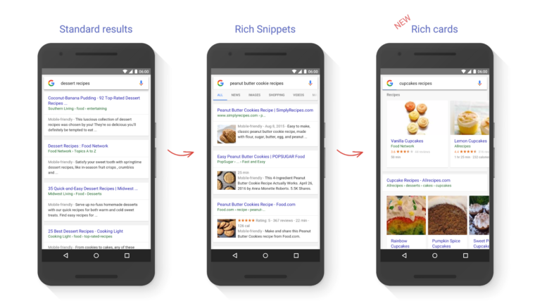
Schema.org, Rich Snippets, and Rich CardsAs Google shifts towards more of a card-based format in the SERPs, and especially on mobile devices where the screen height means limited screen real estate, any steps we can take to obtain enhanced results like rich snippets and rich cards (through the use of structured data markup) becomes increasingly valuable.
If you aren't sure what type of structured data might be right for your website, you can use my guide for performing a structured data audit.
Other Key Mobile Search Trends from GoogleIn addition to trends around mobile-friendliness as a ranking factor, Google has been working towards a few other key trends which relate directly to mobile technology and user behavior:
We don't have space to go in-depth on these topics here, but here are a few recommended resources you can check out if you'd like to learn more:
AMP
SERP Layout
App Indexation and Streaming
ConclusionMobile technology is changing rapidly, and this has created major shifts in user behavior and mobile web usage worldwide. More than ever, mobile search is becoming the future of SEO, and with that comes a host of new challenges. But the key principles remain the same: ensure that crawlers can access, read, and understand your content, ensure user experience is working well for all devices, and keep testing and iterating for better results.
Featured Image: LDProd/DepositPhotos.comIn-post Photo 1: Google Webmaster Guidelines/developers.google.comIn-post Photo 2: Blog post: Introducing Rich Cards/webmasters.googleblog.com
Source: SEO Guide: An Introduction to Mobile SEO
No comments:
Post a Comment